


No one can afford to skip a newsletter today. Everyone should build their own email list. With a newsletter that has a large number of readers, revenue can be generated at the push of a button.
Many websites have the problem that although a newsletter is offered, gaining subscribers just doesn't work properly. This is a solvable problem, and the solution can be significantly improved through targeted strategies.
The best strategies for gaining more newsletter subscribers
With the following 3 simple steps, more newsletter subscribers can be gained without needing to increase the number of visitors to the email capture page.
Finding the perfect bait
First, a good bait is needed. The problem today is that hardly anyone signs up for a newsletter if the benefit of subscribing is not clearly communicated.
This benefit is created by offering a gift for the free newsletter subscription.
The prospect enters their email address and possibly their first name into the input fields, goes through the sign-up process, and receives a gift afterward.
What can serve as a gift?
- A free eBook
- Software, for example shareware or freemium
- A video that only newsletter subscribers can watch
- A free seminar or webinar
- A voucher to save on the next purchase
- A 7-day email course
It is important that the gift offers real value. Otherwise, this offer is unlikely to lead to a newsletter subscription.
In practice, free eBooks and email courses have proven to be very reliable in almost all industries. Valuable information is often considered a strong reason to subscribe to a newsletter.
For online shops, a voucher can be particularly useful.
In information-based industries, free resources such as eBooks, videos, or free courses achieve the best results.
Additionally, it can be useful to test multiple baits or gifts against each other to find out which generates the most sign-ups. Such tests provide valuable data and should be carried out regularly.
Clearly communicate the newsletter's value
If the value is not clearly communicated, hardly anyone will complete the subscription. Therefore, the sign-up for the email list should be linked with benefits. In practice, this means placing a list of all advantages directly above the sign-up form.
Many newsletter operators do exactly that — it is no surprise that some of them have very large lists.

The benefits are clearly listed, making it easy for potential subscribers to decide to sign up.
Using social proof
Social proof describes the principle that people base their decisions on the behavior and experiences of others. In short: if many others subscribe to or like a newsletter, it automatically appears more trustworthy.
Typical forms of social proof on a newsletter sign-up page:
- Number of newsletter subscribers ("Over 15,000 readers already")
- Short statements from satisfied readers; real voices with names and photos are much more convincing than anonymous quotes
- Endorsements from influencers recommending the newsletter
- Star ratings or short review excerpts
- References to qualifications, awards, or professional contributions, showing that the newsletter is based on solid expertise
When social proof is placed visibly near the form or the sign-up button, it works best and leads to higher subscription rates.
Make the sign-up form more prominent
If the newsletter sign-up form is already integrated into the website but the number of new subscriptions falls short of expectations, it is often due to insufficient visibility.
This problem can usually be fixed within a few minutes.
Newsletter form in the sidebar
If the website has a sidebar, the newsletter sign-up form should be placed as high as possible. This way, visitors immediately see the newsletter sign-up and the gift when entering the site.
It is important that the gift is clearly communicated and that it is made clear why signing up is worthwhile. Not only products need to be sold, but also the newsletter itself.
Particularly effective is a fixed sidebar that remains visible while scrolling. This way, the newsletter offer can always be seen, even if the decision to subscribe comes later.
Newsletter form below each article
Additionally, a newsletter sign-up should be offered below each article. Visitors who read an article in full are among the hottest candidates for the newsletter.
Here too, the benefit of the free subscription is clearly communicated. A clear call-to-action on the button further reinforces this effect.
Newsletter Form in a pop-up box
Pop-ups are not particularly popular, but they are still considered one of the most effective methods to turn cold visitors into newsletter subscribers.
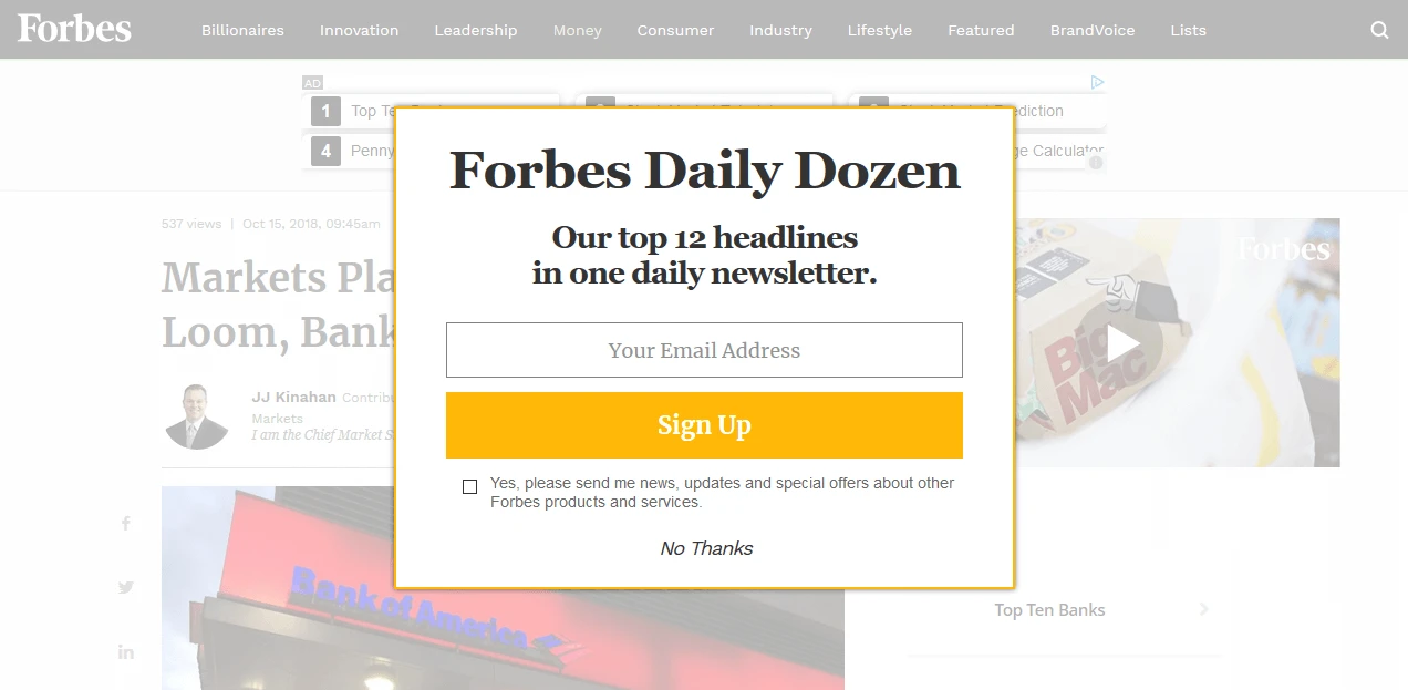
Forbes.com has implemented this very cleverly: when you open an article, a pop-up appears as soon as the page loads, covering the content of the page. It is not too aggressive, but also not too passive. Anyone who wants to can subscribe to the newsletter, while everyone else can close the pop-up.
Technically, it can be set so that a pop-up appears when a visitor is about to leave the page or has already spent a few seconds on the site.
Regardless of the chosen trigger, it should be ensured that the pop-up is shown only once to each visitor. Too frequent displays quickly become annoying.
If uncertain, the pop-up can be displayed shortly before leaving the page. By then, the visitor is usually lost anyway, so the risk is minimal.
Simplify the sign-up process
It sounds simple, and it is: by simplifying the sign-up process, more interested parties join the email list. In this way, the building of the email list is significantly accelerated.
In most cases, asking for just an email address is enough, as it is the only thing needed to send the newsletter. Name and other information are optional and should only be requested if necessary.
Professional newsletter operators ensure minimal effort for sign-up. While they lose some valuable data this way, they gain more email addresses, which is more important than having complete user profiles.

All benefits in fewer words, only asking for an email address — this is how envato makes it easy to turn visitors into newsletter readers.
Use a landing page
A landing page is a specially created website with a clearly defined goal, for example, newsletter sign-up.
In many cases, landing pages work better than simple sign-up forms because they are consistently optimized for a single action and offer only two options:
- Accept the offer
- Leave the page
There are no distractions like navigation elements or other content. The visitor makes a clear choice of "yes" or "no".
Often, only about 3–5% of visitors convert. With a well-optimized landing page, 10% or more is possible in exceptional cases. Some landing pages reach 30% or more subscriptions. These are already perfectly optimized and have ideal visitors.
A good example of a successful landing page:
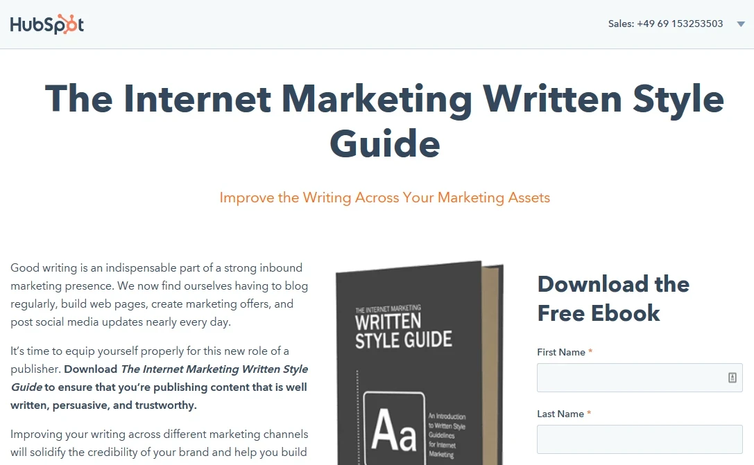
HubSpot uses the classic landing page structure. A large headline, followed by marketing text that makes the free offer attractive for the right audience, an image on the right, and a sign-up form. Everyone immediately knows what is offered and what to do next.
The landing page must clearly communicate what it is about, what benefits result, and what action is required to obtain them.
More subscribers through a better source of visitors
When gaining new newsletter subscribers, the source of visitors is a decisive factor. This is not a strategy, but a basic prerequisite for any online business success.
It makes a big difference whether visitors
- come via search engines,
- through paid advertising,
- or through referrals,
to reach the website.
Visitors from search engines are considered "cold." They do not know the operator, bring little trust, and usually only look for specific information.
Such visitors must first be warmed up before a newsletter sign-up is realistic. The factor of trust plays a central role in this.
This warming process can happen relatively quickly if high-quality and, above all, useful content is provided that immediately helps and makes visitors want more.
For this reason, almost all large companies today operate their own blog. Content marketing builds trust and demonstrates expertise.
Anyone who wants to gain newsletter subscribers should be perceived as an expert — after all, this expertise is also expected in the newsletter.
Who enjoys reading a thematic newsletter from someone not considered knowledgeable?
True experts do not claim to be experts — they let their work speak for itself.
Visitors must first be prepared through content before they become potential newsletter subscribers.
Exactly for this reason, pop-ups on the first page visit are often a bad idea. Visitors from search engines do not yet know the provider and tend to be skeptical.
The likelihood of signing up at this moment is very low.
A similar problem occurs with paid advertising. Here too, trust is initially missing and must be painstakingly built up.
Considering the importance of the visitor source, it quickly becomes clear why gaining new newsletter subscribers is a real challenge.
Many newsletter sign-ups therefore do not happen on the first visit, but with returning visitors. Returning visitors have already built trust.
Conclusion
Many websites offer a newsletter sign-up but make fundamental mistakes in the process. This often results in visitors not becoming subscribers.
The strategies described in this article can turn almost any website into a significantly more effective list-building machine.
If the topic matches the visitors' interests and the "gift" or the "benefits of signing up" precisely meet their needs, it becomes much easier to achieve more sign-ups.
Above all, a properly implemented landing page can be very effective in gaining newsletter subscribers and should be both cleanly structured and actively promoted.
On the landing page, there is only one decision: subscribe to the newsletter or leave the page. This simplicity is what ensures high conversion rates.
Finally, the source of visitors must not be neglected. It takes time, patience, and a well-thought-out strategy to engage new visitors for the newsletter.